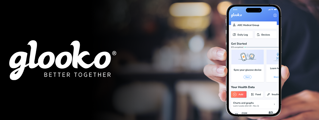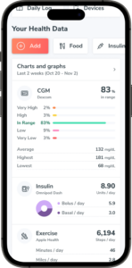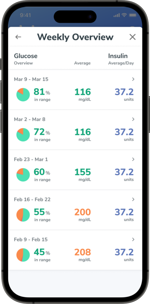

Today, we launched a sleek new look to the Glooko® Mobile App, which makes it easier for users with diabetes to navigate, organize their data in one place and share their data with their doctor and extended care team. We’ve also streamlined data visualization, so users can seamlessly view all their data at once.
The modern look and feel of the Home screen allows for quick access to the user’s most used actions, including seeing glucose trends, logging medication, and tracking food and exercise.
For new mobile app users getting started with Glooko, we’ve simplified the onboarding process and customized it to fit individual goals.
From easily connecting to their clinics and sharing reports with their care team to using the Quick Add slider to conveniently add food, insulin and exercise, the free Glooko Mobile App, available in the App Store and Google Play Store, goes where people with diabetes go.
Wondering what went into the redesign of our digital health app? We sat down with some of the Glooko team members, including Director of Product Design Amanda Martin, Product Designer Ben Stone and Product Manager Chase Sutton, who worked behind-the-scenes to learn more about the process.

What were the goals and motivation behind the Glooko Home screen’s new look? How did you decide what features to highlight in the Home screen?
 While we always take into account feedback from our users, our team performed extensive research and interviews to see what opportunities existed for changes in the app that would result in the greatest improvements. Through this, we landed on focusing our efforts mostly on the Home screen, the onboarding process for new users, and modernizing the user experience.
In this high-impact space, we reimagined how to display insights for users through side-by-side and detailed charts and graphs with all the pertinent data, including its sources, in one place. We added Quick Add buttons for easily tracking food, insulin, medication and other actions important to people with diabetes.
Through our interviews, we learned that users like to feel connected to their doctors and care teams and view that as a major benefit of Glooko. We wanted our users to have a direct link to them, so we added to the Home screen an easy way to reach and share data with them.
We also learned that we needed to improve the onboarding experience by making it quicker to get started and sync diabetes devices. This process was a hurdle for users in the past and we sought to simplify it in the redesign. There’s now a space on the Home screen for new users who are looking to get started with Glooko.
What are some of the main takeaways from the redesign of the Glooko Mobile App? How will this help current and new users?
For both current and new users of Glooko, the updated navigation on the Home screen helps users access key features more efficiently as the older version had many features tucked away and hard to discover. We put popular features, like food logging and sharing data with care teams, front and center on the Home screen—all available with one scroll and featuring the latest synced data.
For new users, we really wanted to give them an easy onboarding experience. We learned that the earlier version of the Glooko app’s onboarding was somewhat complicated and could be viewed as a turn off for people just joining and looking to take full advantage of our digital health app.
The reimagined onboarding is guided and shows new users what to do in a very organized, “bite-sized” way that allows them to easily complete it at their own pace.
What’s the new onboarding process like? Is it easier and does it have less steps for new users?
We learned through our interviews that the onboarding process definitely needed an overhaul. Users would go to the first step of syncing their device and then never went any further with the process as they found it too difficult. Our takeaway was that we needed to get new users to the Home screen right away.
In the new process, users now start on the Home screen and can complete the onboarding tracker, which includes syncing their device, tracking their insulin and completing their Glooko profile, in any order and timeframe. Users now get to experience all the features of Glooko right out of the gate!

How did you take feedback from people living with diabetes when making these changes that improve the experience of the Glooko Mobile App?
Connecting with users and hearing from them is incredibly important to our design process.
We have a human-centered design team, so it was integral that we talked to actual Glooko users to hear their feedback. We took what we learned and brought sketches and concepts for improving the Glooko Mobile App back to them. It’s a cycle that we go through all the time, but one that we really valued in this project.
Our team had some great conversations during this process with users who synced once to those who were very active in the app and constantly logging food. Each user group who provided us with feedback helped inform our decisions in the redesign.
We also used insights from data in the app to verify our theories around user engagement during these interviews.
What’s some of the feedback you’ve received from test users on the new look?
 They’ve all been very excited about the improvements to the Glooko Mobile App.
We’ve received the most feedback about the modern look and feel, responsiveness and colors. Users are also pleased with the personalized way the data is displayed, whether it’s a continuous glucose meter, blood glucose meter or other compatible device.
The simplified, consistent and clean approach to the new experience will continue to resonate with our users—new and existing.
What other changes will be coming in the future to the Glooko Mobile App?
We have an ambitious and exciting roadmap for the mobile app, and much of it is focused on data.
We want users to better understand their overall health, so we’re looking to develop innovative and detailed charts and graphs to enable the next-generation of diabetes insights. These new data insights will give people with diabetes and their care teams the ability to make smarter decisions to improve their health.
Additionally, we’ll introduce personalized nudges that will help encourage behavior change and guide users to better lifestyle decisions in the coming future.
While all these future upgrades are very exciting, we’re giving both people with diabetes and their doctors the ability to see the power of Glooko and what connected care really is in our new reimagined version today.
The Glooko app is now available in the App Store and Google Play Store.
MKT-0434 01